")

Posts
337
Respect
31Add +1
Forum Rank
Perk Hacker
Primary Group
Member
Login Issues
Forgot password?Activate Issues
Account activation email not received? Wrong account activation email used?Other Problems?
Contact Support - Help Center Get help on the UGX Discord. Join it now!
 Reply
Reply
Event_name {
	//action here with ; at the end
}

//or

Event_name {	//action here with ; at the end }


#include "ui/menudef.h"
#include "ui_mp/common_macro.inc"
#include "ui/mission_select/missiondefs.menu"
#include "ui_mp/menustyle.inc"
#include "ui/choices_setup_common.menu"
#include "ui/online_status.inc"
{
assetGlobalDef
{
fadeClamp 1.0 // sets the fadeup alpha
fadeCycle 1 // how often fade happens in milliseconds
fadeAmount 0.1 // amount to adjust alpha per cycle
}
menuDef
{
name main
visible 0
fullscreen 0
soundloop "BACKGROUND_SOUND_ALLIAS" // default is "music_mainmenu"
rect 0 0 640 480
focuscolor 1 1 1 1
disablecolor 0 0 0 0
style WINDOW_STYLE_EMPTY
onOpen
{
setDvar cl_bypassMouseInput "1";
}
onEsc
{
open quit_popmenu;
}
onClose
{
setDvar cl_bypassMouseInput "0"
}
menuDef
{
name main_text
fullScreen 1
rect 0 0 640 480
soundloop "" // default is music_mainmenu
focusColor 1 1 0 1
style WINDOW_STYLE_EMPTY
onOpen
{
CLEARUIHINT
execnow "ui_cinematic VIDEO_NAME 3"
setdvar ui_showOnlineOfflineButton "1";
// setdvar main_logo "0";
//savegameshow resume;
//savegamehide newgame;
}
onFocus
{
execnow "ui_cinematic VIDEO_NAME 3"; // default is bink_front_end_screen_home
}
onEsc
{
play "CLOSE_SOUND_ALLIAS"; // default is "mouse_click"
}
// items go here
// end of items
}
}
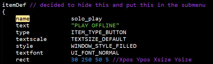
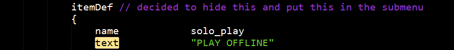
}// Soon to comeitemDef
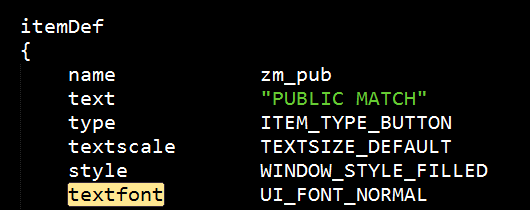
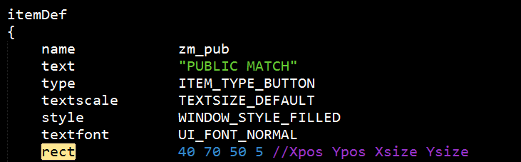
{
name NAME_GOES_HERE
text "TEXT_GOES_HERE"
type ITEM_TYPE_BUTTON
textscale TEXTSIZE_DEFAULT
style WINDOW_STYLE_FILLED
textfont UI_FONT_NORMAL
rect 30 70 50 5
textalign ITEM_ALIGN_MIDDLE_CENTER
forecolor 1 1 1 1
visible 1
onFocus
{
play "mouse_over";
}
leavefocus
{
}
action
{
play "mouse_click";
}
}
itemDef
{
     name            NAME_GOES_HERE
     text            "TEXT_GOES_HERE"
     style           WINDOW_STYLE_EMPTY
     textscale       TEXTSIZE_TITLE
     rect            30 50 50 5
     textalign       ITEM_ALIGN_MIDDLE_CENTER
     forecolor       1 1 1 1
     visible         1
     decoration
}itemDef
{
name NAME_GOES_HERE
rect 35 130 200 100
style WINDOW_STYLE_SHADER
background "MATERIAL_NAME"
decoration
visible 1
}itemDef
{
name "NAME_GOES_HERE"
rect FULLSCREEN
FullScreen 1
forecolor 1 1 1 1
style WINDOW_STYLE_SHADER
background "MATERIAL_NAME"
decoration
visible 1
}


 | Benevolent Soul who has our eternal gratitude and exclusive access to betas and the donator section of the forum. |
 | Has shown effort and knowledge in the area of scripting while being a part of the UGX-Mods community. |
Reply Pontault-Combault, France
 ReplyReplyReplyReply
 Milton Keynes